Week 5-Website Usability

This week I asked two co-workers (Front End Web Developer and UX Manager) and my husband to complete three tasks on each of Miller Lite, Coors Light, and Bud Light’s desktop and mobile websites. For the purposes of measuring usability, I asked the participants to complete three tasks on the desktop and mobile websites:

#1 Use search or navigation to find the number of calories in the beverage on the website. Describe the experience..

#2 Put a specific piece of merchandise in the cart. Time the interaction from start to cart.

#3 Find and ‘like’ the brewer’s Facebook page. Rate difficulty on a scale from 1-5, five being hardest.

I included mobile and desktop because after investigating each of the desktop websites, it seemed like the sites were designed for mobile viewing. Each of the websites are responsive, but optimal viewing is at the mobile dimensions. Below, you will see screenshots of identical pages as they are presented on desktop (horizontal) and mobile (vertical). In addition, I will provide a statement for each site based on the usability findings as well as a recommendation for improvement.

____________________________________________

Bud Light’s desktop page looks and feels very similar to its mobile page. Both are encouraging the user to find a local retailer. The goal for Bud Light’s homepage is clear…make it easy to find and buy.

bud-desktop

Screenshot_20160913-195705.png

#1 Find the number of calories

Bud Light’s website is the only one that offers search functionality on the homepage, and “calories” doesn’t offer any results.  The qualitative feedback I got from two of three testers is that the massive images on the Coors Light and Miller Lite homepages made it hard to navigate through the desktop site, compared to the mobile site. Trying to find the number of calories in each beverage was easier on the mobile sites and took 50% of the time. All three brewers offer a section called “our beers” that lists the calories, so clearly this is an important fact to have readily available on the website. One tester commented that Miller Lite has the easiest to find calorie count, because it’s located in the footer on their homepage of the desktop and mobile site. My recommendation for Miller and Coors is to reduce the size of the hero banners on the desktop sites to provide a more visually manageable desktop site. This will expedite the speed at which people can find information on the desktop site.

_________________________________________________________________

Tons of white space on the desktop version of Miller Lite’s subcategory shopping landing page. A user is required to visit this page and then click into the store from here. It’s not intuitive. A better experience on the mobile version of the Miller Lite site, it still requires the user to visit the subcategory page, but the products are laid out closer to each other and leads the user to scroll.

miller-desktop


Screenshot_20160913-195616.png


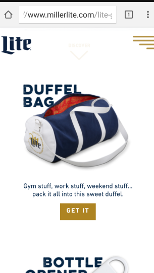
#2 Add a piece of merchandise to the cart.

Bud Light and Coors Light both have direct links to their shopping websites from their homepage. Miller Lite has a link to shop, but it takes the user to a subcategory landing page and requires another click to get to the web shop. Due to the extra step, and the confusion that goes along with it, all three testers said it took longer to put merchandise in their carts on the Miller Lite site compared to Bud Light and Coors Light. Bud Light and Coors Light came in at less than a minute on both the mobile and desktop sites. Miller Lite took one user more than two minutes to add a product to their cart on the desktop site. My recommendation for Miller Lite is to remove the second, unnecessary step from their shopping experience, and provide a direct link to their shopping site on the homepage. This will get people to checkout faster.

_________________________________________________________________

Coors Light’s images are not aligned on the desktop version of the website, but they line up perfectly on the mobile site. Coors light also has a homepage hero banner that takes up the entire desktop, but it only takes up half the page on the mobile site. It seems as though Coors has designed the site specifically for mobile users, which means this is likely where most of their traffic comes from. Even so, there should be a better solution for the desktop version of the site.

coors-desktopScreenshot_20160913-195640.png

#3 Find the Facebook icon and like the brewer’s Facebook page.

This was rated a 1 (easiest) by all three testers on Bud Light and Coors Light’s desktop and mobile websites. Miller Lite received two 2’s and a 3 on this task because the Facebook icon is not located on the homepage. A user is required to click on “It’s Miller Time” from the homepage to find the Facebook icon. Even once the users were taken to the landing page, the images were so large and overwhelming that it was hard to find the icon. My last recommendation is for Miller Lite to place social media icons in their footer. This will make it easier for people to get connected from their branded website and become an advocate of Miller Lite.

Inspiration Journal Week 4- Synergy Ads

This week’s post focuses on beer ads that create effective messages using both text and visuals. I specifically chose ads that require both elements to make the message effective.

My first choice is a Heineken ad. It’s a lighthearted visual, complemented by a serious call to action: don’t drink and drive. The brilliance of this ad is that it effectively makes light of a serious subject, while not offending the consumer. The symbolism of  a red sleigh indicates that either Santa or his reindeer were drinking. The collateral damage is represented by the presents strewn all over the snow.The visual demonstrates the consequences of drinking and drinking in a metaphorical way while the text is serious and literal. Without the text, the visual would not make sense, and the ad would not be effective. The text on this ad is minimal and makes the point using four words.

xhein

Ads of the World. (2005, December). Santa. Retrieved September 5, 2016 from http://adsoftheworld.com/media/print/santa_3?size=_original

My second choice is an ad for San Miguel beer. The message in this ad is not unique, and just about every brewery touts how long they have been in business. Many brewers started in the late 1800’s…we get it. It would be very funny to show a picture of Jesus drinking a beer, but I haven’t seen that yet. (Maybe I’ll use that in my final) The reason I chose this ad is because simply inserting an image of a black and white factory in the background sells the message. The visual may or may not be the actual factory, but the use of the old-fashioned-looking image makes the consumer believe that it is the factory. With so many brewers bragging about being in business since the 1800’s, this ad effectively makes the point through the use of an old picture. I also think that showing the beer coming out of a tap, rather and a bottle or can, emphasizes the “freshness” message. Finally, the fonts, black background and white text all tie into the brand color palette nicely.

print-ad-draughtbeer

San Miguel Brewing Intl. (n.d.). San miguel pale pilsen print ad. Retreived September 4, 2016 from http://sanmiguelbeerinternational.com/print-ad5.php

My third ad is from Imperial beer out of Costa Rica. The design of the ad seems very simple, incorporating the brand colors into the text and the background. The font and the capitalization of the typography are very different than the brand logo. At a time when most beer ads are consumer-based, this product-based ad focuses on the product’s ingredients to drive the message. In particular, the ad uses the scarcity of tropical rainwater to drive preference. As a consumer of beer, this ad makes me want to try Imperial “before it’s too late.” I have no idea if tropical rain water is better than the water other brewers use, but if I don’t try this beer, I may never know. The tone of this ad indicates that tropical rainwater is scarce, which I assume is true. This ad is effective because it creates a sense of urgency and uniqueness around the brand.

imperial-beer

Design Your Way. (n.d.). The best 40 beer print advertisements. Retrieved September 4, 2016 from http://www.designyourway.net/blog/inspiration/the-best-40-beer-print-advertisements/

My fourth ad is from South African brewer, Garagista. I used this brand for the typography journal, and I am using them again based on the visual and textual synergies in their ad campaigns. When the brand released its new beer, “Tears of the Hipster” they also released between five and ten ads that directly go after hipsters. The vocabulary and messaging used in each ad is meant to represent a situation that would result in a hipster crying. The ads are dark and rugged looking, which is the opposite of a trendy, hipster advertisement. Complementing the text element of the campaign, each ad visually depicts a hipster with tears rolling down his face on the bottle. It’s subtle, but the ad even includes a tear drop above the bottle. Each ad has two messages, separated by a line, and the copy “and then brewed a beer form their tears.” The design is consistent throughout each ad in the campaign, using the same layout, font, and colors. I think it’s very interesting that this brand is using reversal ads to attract its target market. Instead of focusing on who should drink the beer, they are focused on who should not drink the beer.

garagista-beer-tears-of-the-hipster-kale-infused-beard-wax

Patricios, O. (2015, August 26). Ad of the week: how to make a hipster cry. Retrieved from http://www.marklives.com/2015/08/ad-of-the-week-garagista-tears-of-the-hipster-foxp2/

My final ad is part of a campaign from brewer Greene King. Each of the ads in this campaign breaks down the portions of a pint glass according to the length of the conversations you’ve had over that beer. The ad below is one in a series of ads that show at least two conversations that take place over the course of a beer. As I read through the ads in this campaign, I associate myself with the messaging. I feel like I’ve had some of these conversations. It’s no secret that people’s attitudes and opinions change over the course of a few beers, and this ad depicts that perfectly. The ads are lighthearted and funny, which makes me want to read them all. It seems counter-intuitive to show an empty glass, but this ad wouldn’t be as effective if the cup were full. Green seems to be a popular color for beer brands, which makes it hard to determine which brand the ad is representing. I am not a fan of having the full beer and creme colored slogan in the footer of this ad. I think the extra info takes away from the simplicity of the ad.

greene-king-ipa-beer-exercise-small-88666

West. G. (2015, October, 22). Ad of the day: greene king to the pub. Retrieved from http://www.advertolog.com/greene-king/print-outdoor/exercise-3146305/


Week 3- Visual Design Ads

In this week’s post, I will share five inspiring beer ads that use visual cues to express a message. Each ad uses very few, if any, words to describe the brand’s message.

My first ad choice is for Heineken. The ad uses a visual metaphor to show the consumer that the drink is good until its very last drop. The way that the Heineken bottle is rolled up like a tube of toothpaste implies that the consumer will do everything possible to get the last drop out of the bottle. Adding to the metaphor, it’s hard to tell in the design if the “tube” is plastic or  glass. I think this ad is effective because I knew exactly what Heineken implied through the visual metaphor, and based on the color scheme, I knew it was a Heineken ad before I saw the logo.

heineken-beer-empty-bottle-medium-86387

Image. (n.d.) Retrieved August 30,2016 from http://files.coloribus.com/files/adsarchive/part_1428/14286155/file/heineken-beer-empty-bottle-medium-86387.jpg

My second ad is for Bergedorfer Beer out of Germany. This brewer uses visual cues to illustrate a “beer baby” beer belly for men. At first I was shocked at the ads, maybe even a little offended, then I realized that the man carrying a “beer baby” was symbolic of women carrying a real baby. I would describe this ad as a combination of a visual metaphor and reversal. It’s a metaphor for women who are pregnant, and it’s reversal because a pregnant women is not likely to drink beer. It’s hard to say if the ads are effective, since I was personally put off by them. If the goal was to shock…mission accomplished.

1

Designswan.com. (2016, June, 28). Humorous ads show father’s to be cradling their beer bellies. Retrieved from http://www.designswan.com/archives/humorous-beer-ads-show-fathers-to-be-cradling-their-beer-bellies.html

The third ad I chose is from Corona. This brand is notorious for associating their products with visually pleasing, relaxed beach scenes. There isn’t anything metaphorical or two-fer about these ads; the ads simply express that Corona is the beer for the beach. The consumer will have a nice, relaxed day on the beach (even if they aren’t ON the beach) when they drink Corona. The biggest takeaway from most Corona ads is that there are always at least two beers. The idea is that you are at the beach with someone of interest, and you will make the most of the day by drinking Corona. Corona is selling a state of mind verses a product.

corona_ad_example

Hall, J. (2009, August, 4).  Marketing that makes the product better. Retrieved from http://www.creativedistraction.com/analysis/marketing-that-makes-the-product-better/

My fourth ad comes from Coors Light, a direct competitor of Bud Light. I chose this ad because it creatively executes brand and event promotion at the same time. This ad uses almost no text to express the Rocky Mtn. cold flavor of Coors Light and the brand’s support of a Mexican soccer event. This ad is cool (no pun intended) because it inserts the soccer field into the can of Coors Light in a visual way. It would have been easy for Coors Light to say “official sponsor of…” but they achieved the same result through the visual ad. This ad was a creative use of space and emphasized the importance of Coors Light through visual hierarchy.

can_stadium_2014

Behance. (n.d.) Coors light mexican soccer league. Retrieved August 30, 2016 from https://www.behance.net/gallery/18670815/Coors-Light-Mexican-Soccer-League

My last ad this week is a real gem…a pearl to be exact. This ad for Carlsberg uses two bottle caps and a drop of beer to represent the beer a “pearl” in an oyster. The bottle caps are symbolic of the oyster shell, and the drop of beer is representative of a pearl. This ad makes the consumer feel like Carlsberg must be something special, if it’s considered a precious pearl. The ad is effective because it’s easy to understand as a visual metaphor for the actual product. Based on the color palette, I originally thought this was a Heineken Ad. Carlsberg should always include it’s brand logo in ads, since they share a similar color and tone as Heineken. carlsberg_pearl

Image. (n.d). Coloribus.com. Retrieved August 30, 2016 from https://www.coloribus.com/adsarchive/outdoor/carlsberg-beer-oyster-8554655/

Week 2 Text-Based Design Ads

In this week’s post I will share text-based design ads with attitude, that relate to Bud Light. All of these ads were produced by brewers from around the world. I will discuss how these ads express attitude, tone, or mood through the use of text in the ads. Probably the most important aspect of each ad is that they clearly define what or who is important to their brand. The only beer I’ve heard of is Stella Artois, yet I have a clear opinion of each brand based on the advertising copy.

The first two ads are from the same advertising campaign for Garagista beer. Garagista is a South African brewer that created a series of text-based ads that poke fun at hipsters, positioning the brand as “anti-hipster.” The ads are funny, if you’re not a hipster, because they feature images of hipsters doing exactly what the ads mock. The copy is large, and the ad is balanced 50/50, which makes the content easy to read and understand.The ads are effective because they are opinionated, specific, and don’t mince words about who should not drink this beer.

garagista

garagista2

Maskeroni, A. (2014, June, 25).South african brewer uses ads to declare all-out war on hipsters. Retrieved from http://www.adweek.com/adfreak/south-african-brewer-uses-ads-declare-all-out-war-hipsters-157986

The next text-based ad is from Stella Artois. The copy in this ad is minimal and doesn’t speak to the beer itself, rather the glass for the beer. This ad is effective because it positions the beer as highbrow, based on it being served in a chalice. The chalice is a superior glass, therefore the beer must also be superior. The tone of this ad is effective for targeting “classy” drinkers who care about appearances. The design of the add uses white space to create contrast for the copy. The white space also simplifies the message.

StellaArtoisChaliceAlcoholicDrink


Horsnell, C. (2012, March, 19) Stella Artois open chalice factory in giveaway tour. Retrieved from http://drink-brands.com/drinks/alcoholic-drink/stella-artois-open-chalice-factory-in-giveaway-tour/

The third ad is from Brazilian brewer, Boca Maldita. This beer ad is part of a series of text-based ads that target young drinkers through the use of social media faux pas. The point size of the text makes the ad copy the most important aspect on the page. Also, the use of color for the word, Instagram, makes it pop off the page. The actual copy in the ad effectively expresses a problem/solution scenario, positioning the beer as the solution. “Drink this beer to forget about your problems” is the message. The target market for this ad would identify with the scenario as well as the social media platform, Instagram.
BocaMaldita


Candy Shop. (n.d.). Ads of the world. Retrieved August 8, 2016 from https://www.google.com/url?sa=i&rct=j&q=&esrc=s&source=images&cd=&ved=0ahUKEwiByKbMrNrOAhVE0iYKHTF0ChEQjxwIAw&url=http%3A%2F%2Fadsoftheworld.com%2Fmedia%2Fprint%2Fboca_maldita_instagram&psig=AFQjCNFXPJZ4D74BFplqX3aIJHpdqxzfMA&ust=1472138280715081

The fourth ad is for Mill St. brand beer, based in Toronto, Canada. The black text on the stark white background “checks the box” for an advertisement and effectively makes the reader believe that author would rather be brewing beer. The copy indicates that the beer is what makes the brand, not the advertising. The ad copy appeals to the consumer’s sense of humor while positioning the brand as a serious brewer. This ad is effective because it uses simple text and a lot of white space to play down the importance of the ad. The ad makes the consumer believe that the beer is good enough to speak for itself.

MillStreetBrewery_RefreshinglyHonest16

Jardine, A. (2016, July, 28). This refreshingly honest beer ad was created in microsoft word. Retrieved from http://creativity-online.com/work/mill-street-brewery-refreshingly-honest/48372

The last ad is for Seattle-based beer brand, Red Hook. This ad originally caught my eye because of its shape. Having the bottles extend past the traditional billboard rectangle is appealing. After the billboard caught my eye, I realized the copy was funny, and it made me feel a little embarrassed after reading the billboard. This ad is effective because of it’s abnormal shape, as well as using clever copy to introduce new branding and packaging in a memorable way. Based on the tone of the ad copy, the company is probably lighthearted and doesn’t take themselves too seriously.


red hook

Evans, E. (2011, May, 9). Redhook may 2011 beer ads are filled with cheeky attitude. Retreived from http://www.trendhunter.com/trends/redhook-may-2011-beer-ads

By Kim Carlson

Inspiration Journal Week 1

In this week’s journal entry I will share five ads and discuss what is effective about the ad design using design terminology and concepts. I will also discuss how the ads relate to my researched brand, Bud Light.

The first effective advertisement I chose for inspiration is Corona’s “Find Your Beach” ad. Corona and Corona Light are both direct competitors of Bud Light and target a similar, adventurous, fun-loving, like-to-have-a-good-time audience. The difference between Bud Light’s advertising and Corona’s advertising is the tone of the ads. Corona’s message is one of relaxation while Bud Light’s is more intense and encourages spontaneity and partying. One design feature of the Corona ad is sex appeal. A presumably “hot” woman in a bikini is carrying two beers. Most men probably assume the extra beer is for them.  The ad uses very little text, and the only reference to the brand is on the bottle. The ad is slightly unbalanced, with most of the elements on the left half of the ad. Last, the font is light and airy, and it looks like something you would find on a boardwalk sign at the beach.

cxflow_02-1024x768

Liebl, J. (n.d.). Find your beach. Retrieved August 17, 2016 from http://jliebl.com/?portfolio=1742

My second choice is an ad from one of Bud Light’s biggest competitors, Miller Lite. This ad was used to target young, artistic males by getting them engaged in a typography contest on Instagram. This ad is effective because it incorporates an unusual typography into the design. The ad looks like it could have been created by a contestant. The color schemes and the fonts give the ad a consistent look and play into the typography contest. The color of the ad text matches the color of the bottle labels.The design of the ad text aligns around the beer through the use of font sizing. The use of lines around the bottle necks illustrates the sound of two bottles hitting each other. Last, the appeal of the ad is that you’ll have a great time when you drink Miller Lite.

millennialtargeted-typography-ads-the-miller-lite-campaign-targets-male-mil

Floyd, A. (2015, August, 4). Miller lite campaign targets young males via instagram. Retrieved from http://www.trendhunter.com/trends/millennialtargeted-typography-ads-the-miller-lite-campaign-targets-male-mil

The next ad I chose is effective because it appeals to the “personal” aspect of advertising. Similar to Bud Light, Coca Cola is using content marketing and hashtags to generate buzz and reach social media users. Coke is appealing to individuals through the use of first names on their bottles. The design of this ad is classic to Coke’s brand and incorporates the nostalgic Coke bottle rather than the can. The color scheme and font are aligned with the standards of the Coke brand. This ad is appealing because it incorporates the personal message as well as serves as a reminder of the good old days.

am_sac_main_v2

Salm, J. (2014, November, 17). Top content marketing trends of 2014. Retrieved from http://www.scribblelive.com/blog/2014/11/17/top-content-marketing-trends/

My fourth choice is also a competitor of Bud Light, and it’s an image-based ad that effectively taps into the adventurous side of the consumer. Coors Light ads use color (blue and white) and images of mountains, snow, and ice to make the consumer feel refreshed. In contrast, the brand uses the color red, a hot color, to emphasize the brand name on the label. The Coors Light USP, “The World’s Most Refreshing Beer” is incorporated into the design to remind the consumer why Coors beer is better. Last, the ad uses three silver bars to establish balance and movement within the ad. The upward direction of the bars reflects the direction that the climber is likely moving.

coors-light-advertisement-cold-refreshment-taylor-castle

Castle, T. (n.d.). Coors light explorer Ad. Retrieved August 17,  2016 from https://www.visogler.com/contributor/taylorcastle/coors-light-explorer-ad/photography/

The last effective ad design I chose is the Monster Energy drink logo. This choice is based on Monster having a similar target market to that of Bud Light, adventure-seeking young males. Monster is an energy drink that targets young males who consider themselves extreme and are looking for a good time. The shape of the Monster brand logo is supposed to represent the claws of the animal that lives inside all of us. Using a bright lime green color for the “M” provides significant contrast against the black background. Hierarchy is created by the size and placement of the “M” in the logo. Even if you don’t remember the name, Monster hopes you’ll remember the logo.

monster-logo-700x390

Monster Energy. (n.d.). Monster logo. Retrieved August 17, 2016 from https://www.monsterenergy.com/


10 Signs That You’re in a Healthy Relationship

Since we are talking about relationships this week, let’s start with a list of 10 signs that you’re in a healthy relationship.

1. You give each other personal space
2. You trust each other
3. You don’t rush milestones
4. You can talk about anything
5. You inspire each other to be better
6. You appreciate the little things
7. You accept each other for who you are
8. You hold each other up during tough times
9. You’re able to let go of the past
10. Your relationship has gotten stronger over time

Now, think about your favorite brand…are you in a healthy relationship with the company? Are they giving you your personal space? Do you trust them? Has your relationship gotten stronger over time? While this is meant to be tongue in cheek, there are some similarities between our expectations for healthy relationships with people and with brands.

For most people, a new relationship starts slow. You get to know the other person a little bit at a time, through conversations and spending time together. You warm up to each other; you don’t ask for their hand in marriage on the first date. National Geographic is overwhelming in this regard. I might even say they are a little stalker-ish. We’ve only been hanging out for a couple weeks, and they want to spend every other day together via email. They post on my Facebook page multiple times each day, and if they see me on their website, they want me to tell them more about myself. If Nat Geo were a guy, I would have been out of here after the first week. They are trying to build a relationship with me through persistence, and it’s kind of a turn off.

Nat Geo clearly subscribes to getting to know their customers in order to build a personal, customized relationship. They learn about their customers’ preferences and monitor user activity through email blasts, social media, on-site contests, interactions with articles, donations, subscriptions, and purchases. As an online account holder, I even have a separate email inbox within my Nat Geo account that receives different email notifications than my personal email. (see image above).

According to the online article Top 5 CRM trends for 2015, “In order to be effective in this new year, companies will seek to know more about its customers and use that insight to talk, engage and interact with their customers more often and more meaningfully in new and innovative ways.” Unfortunately, Nat Geo takes this statement to the extreme and still doesn’t always engage in a meaningful way. The article specifically calls out customization and personalization of content as ways to improve the customer relationship. Nat Geo uses my first name in every email blast, but the content within the email blasts isn’t always relevant. This is one area where Nat Geo could improve. Send me less information, and make my emails more relevant. The relationship won’t seem so overwhelming, and I will be more likely to engage with the content.

Depending on where you on the website, the customer experience is very different. Within the eCommerce store, the retail experience feels very similar to most online stores. Navigation includes search and search filters in order to find something to buy quickly. I haven’t made a purchase yet, and I’m afraid to find out what will happen when I do. I can only imagine the attention I’ll receive when I turn from a lead to a customer in their CRM system. On the “news” pages of the website, the customer experience is all about engagement. They ask users to share posts, upload a picture, make a donation, take a trip…they REALLY want you to DO something other than just consume the news articles.

I haven’t had to use Nat Geo’s customer service, but links to customer service appear in the footers on the eCommerce store and the general news website. I found a comprehensive library of commonly asked questions within the customer service portal on the homepage, and it’s searchable!

In closing, I’m not sure about my relationship with Nat Geo. I know it’s a good organization, doing amazing work for our planet, but I’m not sure I have the time for this kind of commitment. I’m tempted to break up with Nat Geo after this class if they don’t give me some space.

By Kim Carlson

Christ, S. (n.d). 10 signs you’re in a healthy relationship. http://www.lifehack.org/articles/communication/10-signs-youre-healthy-relationship.html

CRM Trends. (n.d.). Top 5 crm trends for 2015. http://www.crmtrends.com/crm.html

Advertising Overload on Nat Geo’s Website

Saying that National Geographic (Nat Geo) advertises on their website is an understatement. Nat Geo is in your face, non-stop, with advertisements. There is an advertisement banner in the header of every landing page and multiple banner ads aligned on the right side of each page. I visited 20 different landing pages, and no page has fewer than two banners ads; most have more.

Some of the banner ads on Nat Geo’s website are for products and services that are relevant for Nat Geo readers. Land Rover, Toyota, Travel to Ireland, and Paradise Hotels in Costa Rica are all targeting the adventure-seeking visitor. Other ads don’t make any sense and are likely generated as part of a display advertising campaign. Ads for Liberty Insurance, Nationwide Insurance, HP, Kroger, and Eliquis Pharmaceutical, don’t seem relevant to my search history. These ads are more annoying than the ads that are aligned with Nat Geo’s target audience. On Nat Geo’s mobile site, ads have completely covered the content I was viewing, making it impossible to finish an article. This experience is extremely frustrating. I would consider making a donation just to view their site without ads. Nat Geo also uses banner ads on their website to push their products. I’ve seen ads for Nat Geo Expeditions, its online eCommerce store, and subscriptions to magazines.

While Nat Geo uses banner ads to push its online eCommerce store, magazine subscriptions, and Nat Geo Expeditions, they don’t use banner ads within the eCommerce store.In fact, one of the only places on the Nat Geo website with no ads is in the eCommerce store. Within the store, there are simply merchandising banners for Nat Geo products. Nat Geo sells adventure gear& gadgets, home & garden supplies, DVDs, books, maps, and jewelry in its online store. Once a user is in the Nat Geo eCommerce store, the goal is to keep them on the site, limit distractions, and convert them to a sale.

Nat Geo participates in affiliate marketing on other websites, driving traffic to its online store. I read on Nat Geo’s website that the starting commission rate for conversions associated with a sale in their online store is 6% of sales. Nat Geo does not offer an affiliate program on its site; they only offer traditional advertising in the form of banner ads.

I receive communications from Nat Geo in the form of emails and Facebook posts. Since registering for its e-newsletter seventeen days ago, I have received ten emails. The emails are always jam packed with content and include multiple calls to action. So far, Nat Geo has only asked for a donation one time. Most of the emails and Facebook posts are a combination of articles, videos, and banners for shopping in their eCommerce store. The communications from Nat Geo are not always relevant to me, which leads me to believe that I need to update my preferences on the website to limit the number of communications I receive.

My biggest complaint about Nat Geo’s ads is that they are often pop-up ads that are hard to close and get in the way of content. According to an online article on the website usertesting.com, “The best pop-ups don’t force users to interact with them. They collapse when the user clicks outside of them, they have a clear X in the top right corner, and they use cookies to remember when users exit out of them.” That same article states, “Make sure you test your pop-up on multiple mobile devices, too. If it won’t close, doesn’t scale down, or breaks the mobile experience in any way, make sure to turn it off for mobile users.” Nat Geo does not subscribe to either of these best practices, which makes for a poor user experience on its desktop and mobile websites. I’d be less offended by the ads if they weren’t in the way of what I was trying to read. Nat Geo needs to improve its pop-ups to align with the best practices listed above.

By Kim Carlson

Resources:
Alvarez, H. (2014, September, 23). Pop-up ads: The most hated web experience, and how to do them right (if you have to). Retrieved from https://www.usertesting.com/blog/2014/09/23/the-most-hated-web-experience-and-how-to-do-it-right/

National Geographic’s Newsletter- Post 3

I signed up for National Geographic’s newsletter on their website and received a Welcome email less than 24 hours later. The Welcome email included four calls to action including, view member benefits, see today’s photo, watch featured video, and visit the online store. The email also included a free copy of Nat Geo’s Guide to Photography e-book. The second email came two days later and asked me to identify my interests, based on Nat Geo’s newsletter categories. The email took me to an online form, where I chose five topics of interest. I have received three additional emails from Nat Geo in the first week regarding specific interests I identified in the registration process. That’s five total emails in the first seven days of signing up for the Nat Geo newsletter. Following the initial three emails, the cadence slowed down to an email every three days.

To update email preferences, users must log into their account and choose their interests. There isn’t a link to complete this action from the emails. Also not included in the emails is personalization. I expected to see my name in the Welcome email. If someone is going to ask me to donate money, I would expect them to insert my first name into the email.

The look and feel of every email are consistent across desktop and mobile. In fact, the emails render exactly the same across devices and contain the same images, content, and calls to action. Not surprising, the emails are packed full of images and links to content on the Nat Geo website. According to a recent article on Forbes.com about mobile-optimized email newsletters, “Use a single call to action. While having a strong call to action is important in every type of email you create, it’s even more important on mobile.” This statement would indicate that Nat Geo should reduce the number of calls to action to one or two, instead of four or five. That same article says, “Use images sparingly: While images can be great for adding visual interest, having too many (or having images that are too large) can wreak havoc on download times.” Nat Geo uses many photos in their emails, which causes latency when loading the email. I experienced this first hand on my mobile device. Nat Geo has an opportunity to simplify their mobile newsletters by reducing images and calls to action.

If I were designing an email for Nat Geo, I would target subscription holders that are up for renewal in the next three months. I would pull the email list from Nat Geo’s internal customer relationship management tool (CRM), run it against any opt-outs, and include personalization. I would include a header in the email with links to Shop, Watch, Read, Donate, and Learn More.  I would also include a “Share” button on the subscription landing page that links to social sites with the content, “I just renewed my subscription to Nat Geo. I’m making a difference in the world.” The email would include a promotion for a free world map upon renewing by the end of this year.  To test the subject line, I would run an A/B test, sending half of the list an email with the subject line below. I would send the same email to the “B” list with the subject line, “Exclusive Offer for Member’s Only.” The “A” email would include one call to action and look something like this:

Subject: Earn a FREE Gift With Your National Geographic Renewal- Limited Time!

Thank you for your subscription to National Geographic Magazine! Your support helps to fund more than 500 projects worldwide. To show our gratitude, we are offering existing members only a FREE world map when you renew your subscription. This offer is only for a limited time, so act before December 31st, 2015.

<img src=”world_map.jpg” alt=”Free World Map”>  (HTML on purpose for this class)

Click here to renew your subscription and take advantage of this exclusive offer for members only.

Sincerely,
The National Geographic Team

To measure the success of the emails against campaigns goals, I would code each email so that I could track the A/B results using Google Analytics campaign tracking. Google Analytics would allow me to measure bounce rate, email open rate, # of completed subscriptions attributed to email, revenue generated from the “Shop” link, and an eCommerce conversion rate.

By Kim Carlson

Resources:
DeMers, J. (2015, April, 8). How important is a mobile-optimized email newsletter? Forbes. Retrieved from http://www.forbes.com/sites/jaysondemers/2015/04/08/how-important-is-a-mobile-optimized-email-newsletter/3/

National Geographic Tells Stories Using Multiple Mediums.

Believe it or not, National Geographic has been “inspiring people to care about the plant” since 1888. That’s when this non-profit organization was formed, and that’s when they began telling stories through the use of photographs. Using photographs to captivate an audience, tell a story, and inspire change has always been National Geographic’s mission; however, with the emergence of the Internet, National Geographic is telling stories in more places, using more platforms than ever before. Watch this YouTube video to get inspired.

In the past, National Geographic primarily used its print magazine to tell stories. For years, they relied on this medium alone to generate buzz and excitement about science, exploration, education, and our planet. In the past two decades, National Geographic has adopted new channels to tell stories. Literally. They have a cable television channel and a YouTube channel.

Visit National Geographic’s website and you will be blown away by all of their digital content. They have an email newsletter, multiple blogs about diverse topics, links to social media sites, an entire section devoted to kids, news articles (with photos), photo contests, travel recommendations, and they even have an eCommerce store to shop for books, clothes, maps, and travel gear. Most impressive, they offer expeditions that allow you to take a trip with National Geographic! I’m hard pressed to find an online marketing channel that National Geographic isn’t using. In fact, since starting this blog, I have signed up for their newsletter, subscribed to their YouTube channel, and liked their Facebook page. Multiple times each day National Geographic serves me digital content through email and social media. It’s clear that National Geographic’s online strategy is to completely immerse their users. Fans can connect in almost any possible way, and they can even participate by submitting a photo, voting on their favorite photo, taking a trip, or making a donation.

(I’m going to pause for just a second and share how excited I am about the THOUGHT of taking a trip with National Geographic. It would be a dream come true, and until several hours ago, I didn’t even know it was possible. I am, hook line and sinker, excited and inspired by Nat Geo.)

One thing that’s clear when you visit National Geographic’s website is that their online strategy is to educate, not sell. At least not sell in the way that most organizations think of selling. They are selling empowerment…to make a difference, either through personal practices, volunteering, or donations. The homepage is organized similarly to a news website, with the most recent stories on top, and include’s today’s contests and events. The website is not highly customized for the individual users, but their email blasts take user preferences into account. When I signed up for their newsletter, I chose specific topics that I wanted further information about.

As I mentioned above, I signed up for National Geographic’s newsletter, liked their Facebook page, and subscribed to their YouTube Channel. Even though I only provided an email address, National Geographic is probably using this information to monitor my online activity and segment me into the appropriate marketing automation campaign. Until I am a subscriber or make a donation, they aren’t likely to get my full billing and shipping information. One convenient tool that they are using is single sign-on. I was able to use my Facebook credentials to log in and leave a comment on a blog, as well as vote for my favorite photo of the day.

As a non-profit organization, National Geographic relies solely on donations to fund its operations. They have foundational and government partners, and they have individual donors like me and you. It seems hard to believe in this day and age that an organization as big as National Geographic is sustained by donations. It gives me hope for humanity. It also speaks to the influence that photography has on people. I’m already beginning to think about ways of incorporating photography into the marketing messages I create at work.

By Kim Carlson

Resources:
http://www.nationalgeographic.com/
https://en.wikipedia.org/wiki/National_Geographic_Society

photo credit: National Geographic via photopin (license)

Digital Marketing Goes Wild

Let’s play trivia for a moment. Name a magazine that was popular in the 1980’s and 1990’s that shared photographs of world events, science, and the planet. Not sure yet? One more clue. Its brand logo consists of a single yellow rectangle. The answer is National Geographic. Congratulations if you answered correctly.

For the next six weeks, I will be following National Geographic and blogging about their digital marketing efforts that pertain to current events. I chose National Geographic for three reasons. First, I am a fan of their altruistic, non-profit, make-the-world-a-better-place agenda. Second, National Geographic is an example of an organization that has successfully evolved from a single-platform medium (print magazine) to a multimedia machine of online content, cable television channels, and social media dominance. With more than 100 million likes across three Facebook properties, four million YouTube subscribers, and ten million followers on Twitter, National Geographic is undoubtedly an influencer in the social media worlds of science and education. Last, due to their diverse digital marketing mix, and their focus on timely, relevant topics, National Geographic meets the requirements for this assignment.

Please follow my blog for weekly updates on National Geographic’s digital marketing efforts.

By Kim Carlson

photo credit: photo credit: IMG_6716 via photopin (license)